Comcast ULearn UX/UI XD Kit
The Adobe UX/UI kit was developed to streamline the design process for visual designers at ULearn, ensuring consistency across all digital products. This comprehensive kit serves as a centralized resource for design elements, enhancing collaboration and efficiency within the team.
Problem
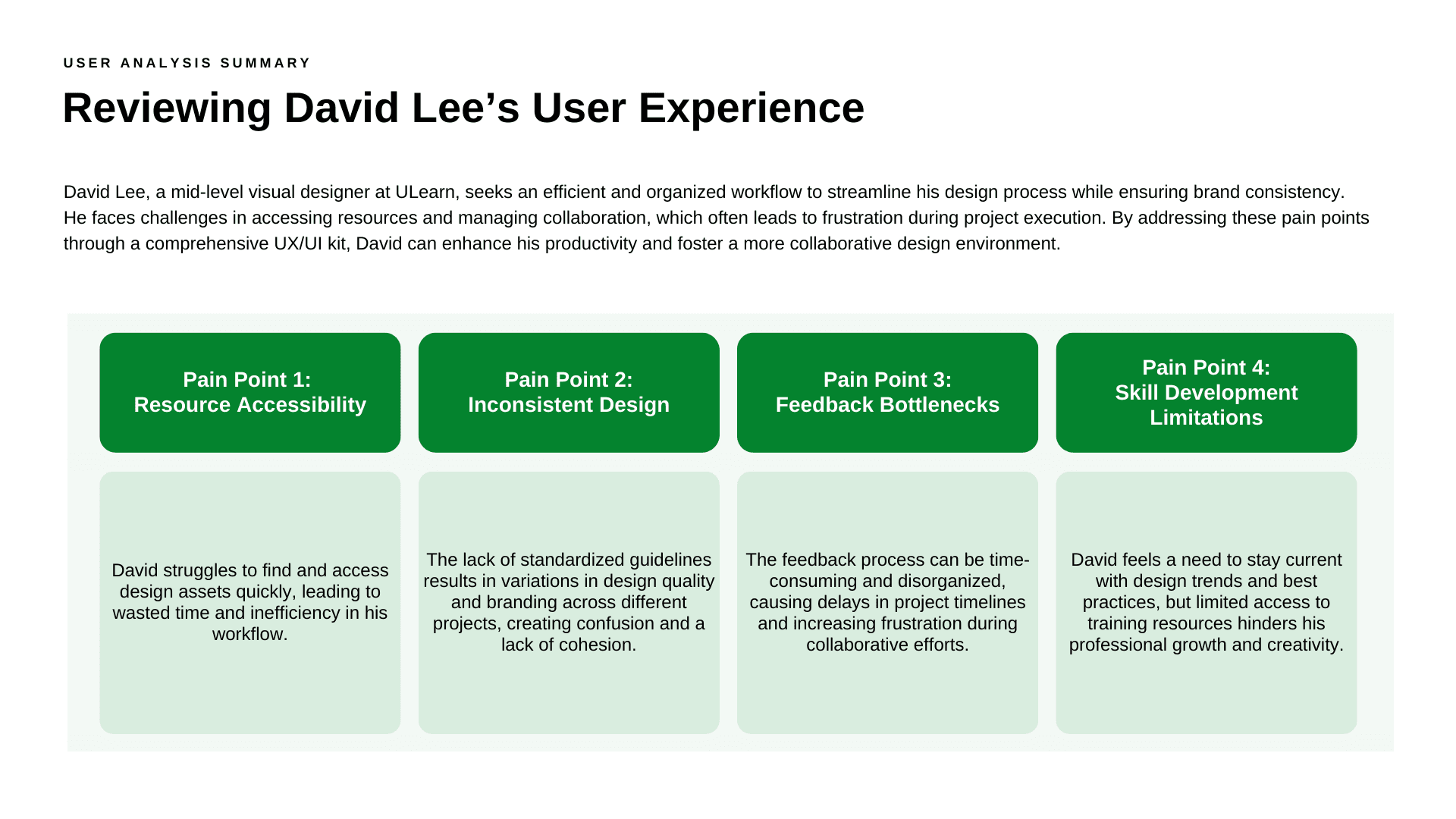
Visual designers at ULearn faced challenges with resource accessibility and inconsistent design practices, which hindered their ability to create cohesive digital products. The absence of standardized guidelines led to confusion and variability in design outputs.
Solution
To address these challenges, I designed and developed the Adobe UX/UI kit as a centralized resource that provides clear guidelines and accessible design assets. By incorporating essential design elements and promoting best practices, the kit enables designers to streamline their workflow, maintain brand consistency, and enhance collaboration within the team.
Design Thinking
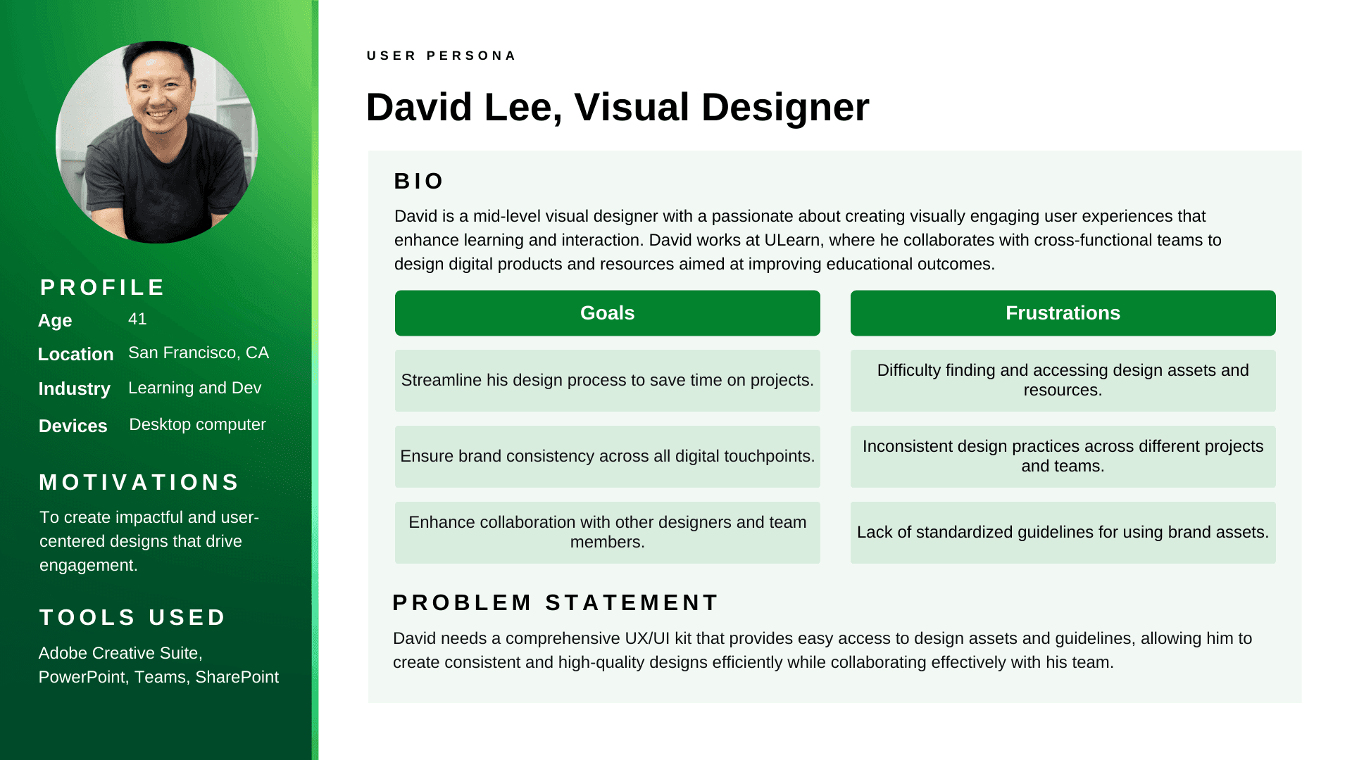
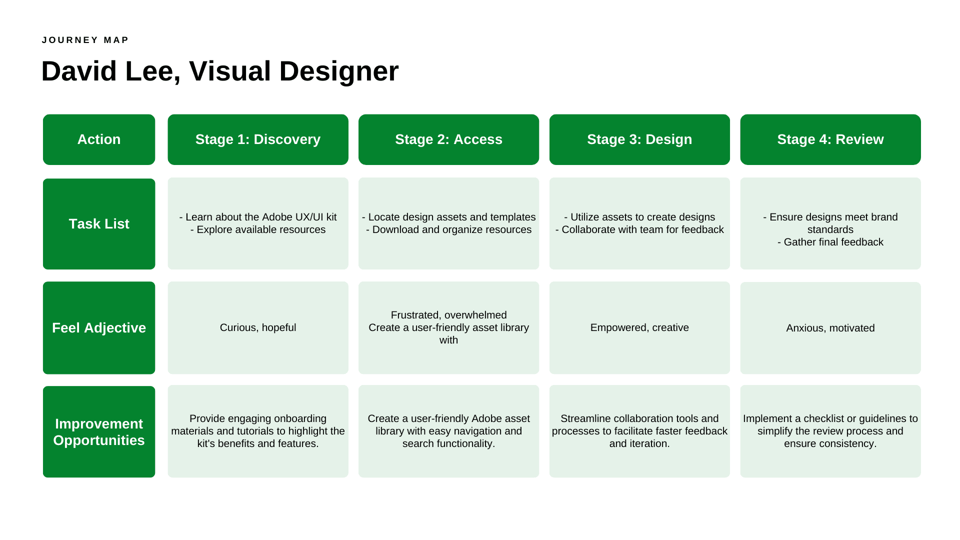
Empathize: I conducted interviews and surveys with ULearn designers to understand their challenges, workflows, and needs. This step helped identify pain points such as difficulties in accessing resources, inconsistencies in design practices, and finding the right type of asset to use for various scenarios.
Define: Based on the insights gathered, I defined the core problem: designers need a cohesive set of resources that promote brand consistency while streamlining their design processes.
Ideate: I collaborated with stakeholders to brainstorm features and sections for the kit. Ideas included organizing resources into clear categories and providing visual guidelines to facilitate quick access to design components.
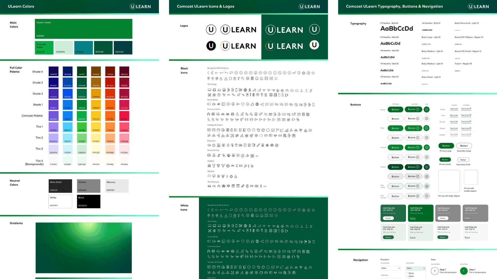
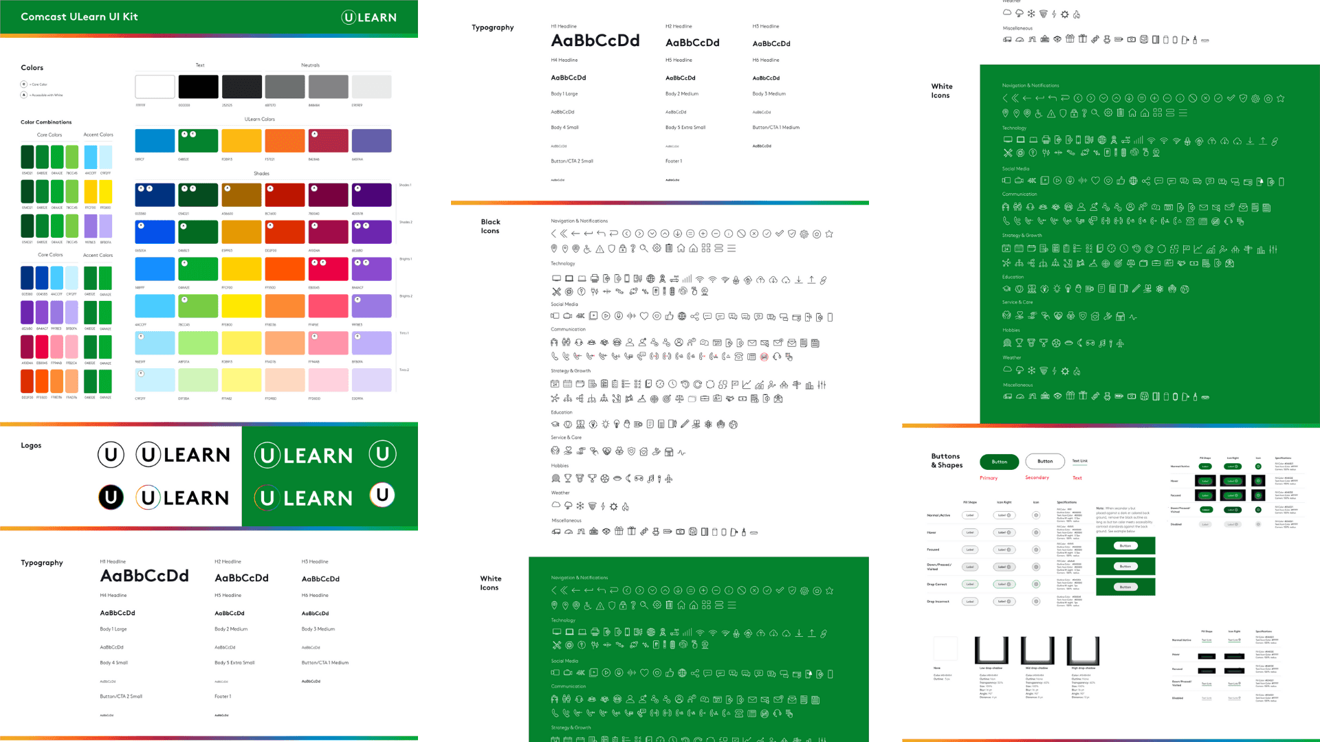
Prototype: I created a prototype of the UX/UI kit, including sections on main colors, product colors, gradients, visual components, icons, text hierarchy, logos, shadows and shapes, typography, buttons, and page navigation boxes. This prototype was shared with the design team for feedback and iteration.
Test: I conducted usability testing sessions with designers to gather feedback on the kit’s layout, functionality, and clarity. Iterations were made based on their input to enhance user experience and address any remaining challenges.
Additional Details
The key sections of the UX/UI kit included:
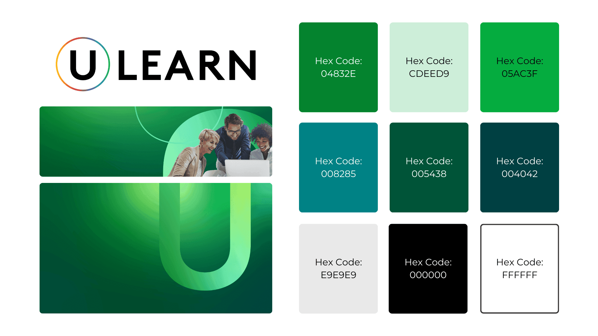
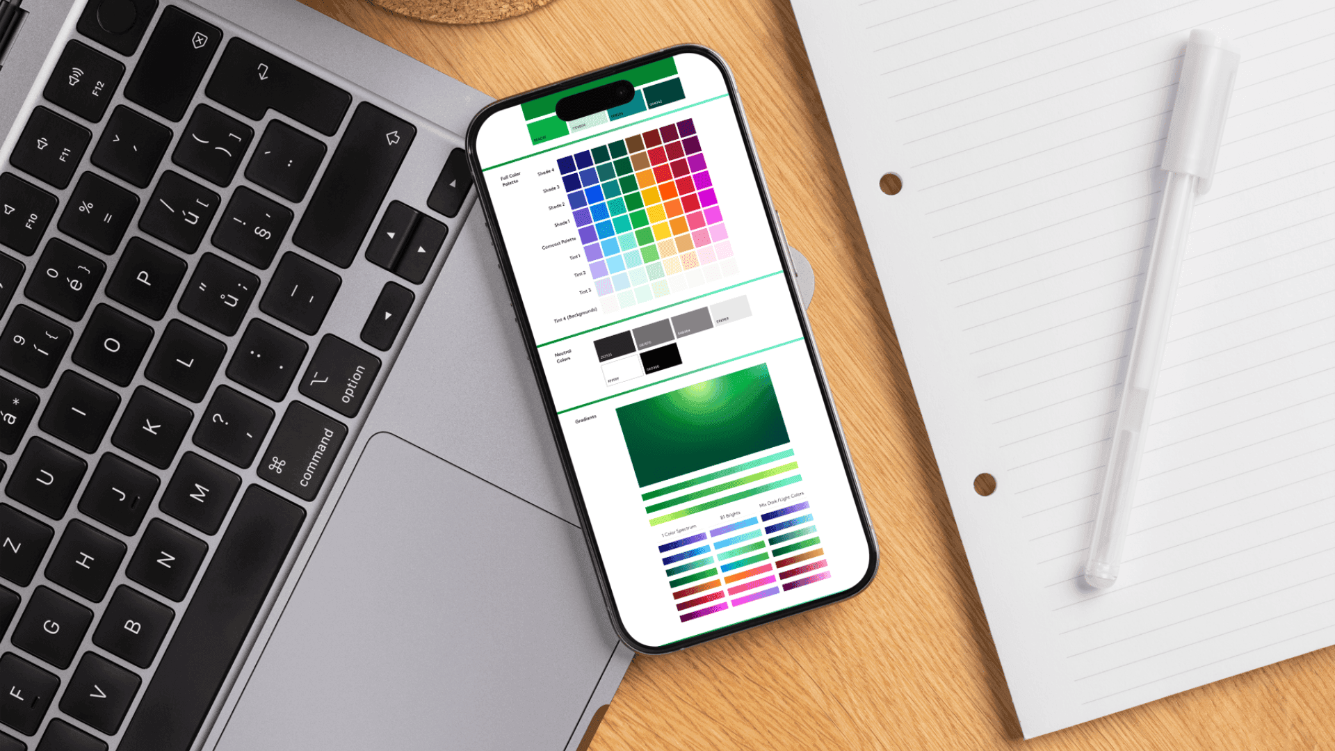
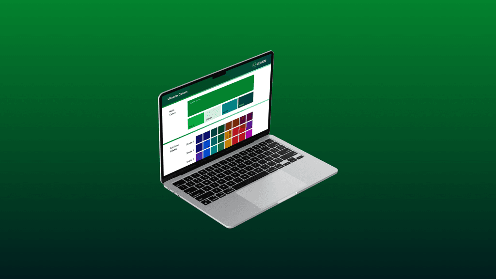
Main Colors: A defined palette that ensures brand consistency across all designs.
Product Colors: Specific colors for individual products to maintain differentiation while aligning with the overall brand.
Gradients: A selection of gradients that can be applied for depth and visual interest.
Visual Components: Essential UI elements like cards, forms, and other design components.
Icons: A library of icons to enhance visual communication and user navigation.
Text Hierarchy: Guidelines for font sizes and styles to create a clear and organized information structure.
Logos: Proper usage guidelines for ULearn logos, ensuring brand integrity.
Shadows and Shapes: Recommendations for shadow effects and shapes to enhance UI aesthetics.
Typography: A set of fonts with guidelines for usage to maintain a consistent typographic style.
Buttons: Styles and variations of buttons for clear call-to-action elements.
Page Navigation Boxes: Standardized navigation components to improve user experience and flow.
Outcome
The Adobe UX/UI kit has significantly improved the design workflow at ULearn, enabling designers to work more efficiently and cohesively directly within the design tool. By providing a centralized resource that addresses their needs, the kit fosters collaboration and ensures that all digital products are aligned with ULearn’s brand identity.

